Avoid traffic jams. Park clear, move clean.

  • Proximity to the Ring
  • Excessive traffic congestion in Brussels
  • Access to public transport
  • Encouraging the transition to sustainable mobility

The Ceria-Coovi P+R project was the winner of the architecture, construction and pre-financing competition (design, build and finance) for the Brussels Capital Region, and is part of an initiative to reduce congestion in the Belgian capital.

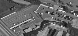
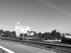
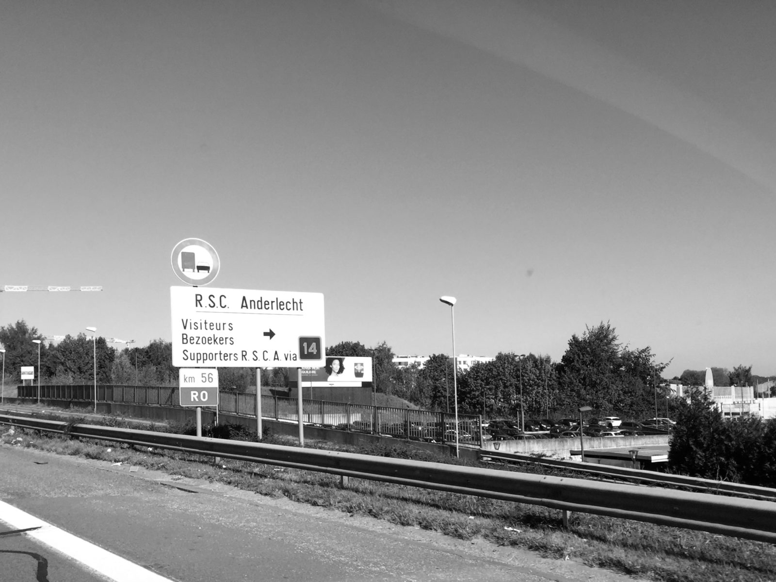
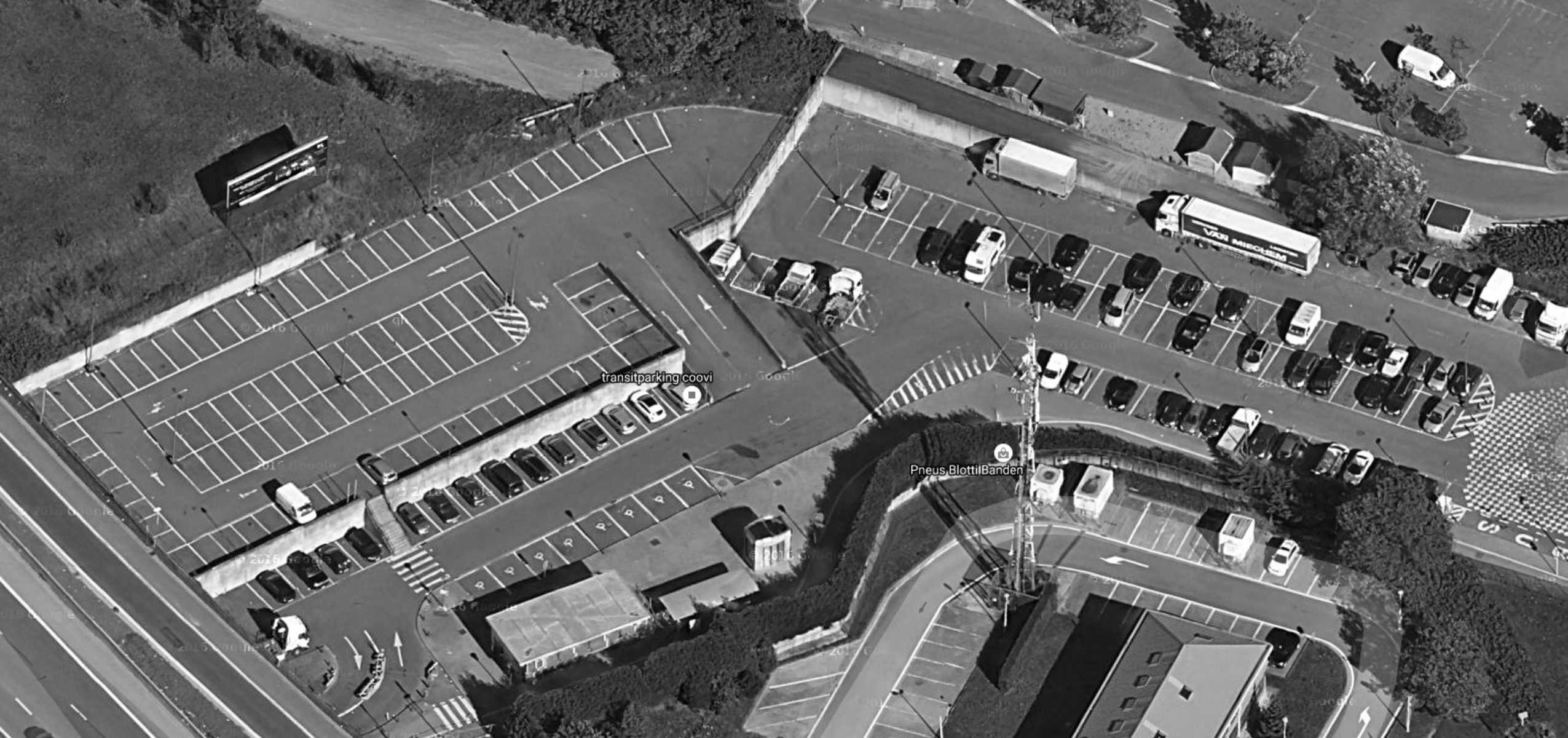
The project has a prime location due to its proximity to the Ring, to the future CERIA station, a cycle route and one of the two access points for the CERIA metro station. In addition, it is close to two higher education campuses (CERIA and Erasmus), commercial sites of supra-regional scale, and several neighbourhoods undergoing major development (Quartier de la Roue and Quartier des Trèfles).

Creates a multimodal node that:
— Fits with the regional aim of reducing congestion in the capital
— Encourages urban densification
— Offers more sustainable mobility

Solutions

01 Urban planning

Free up public space

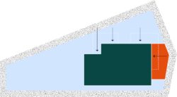
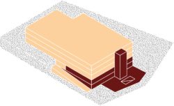
Guided by environmental considerations and a quality urban planning approach, the project significantly reduces its footprint, resulting in improved soil permeability and reducing the visual impact from Chaussée de Mons.

The freed-up space is reallocated to green landscaped areas. A new green embankment provides a sound barrier against the noise of the Ring. The different types of vegetation are adapted to the location in order to support the nesting of local biological organisms as best as possible. Rainwater management is carried out in such a way as to encourage the infiltration of water directly onto the site, with the project proposing an stormwater infiltration basin.

A small plaza for pedestrians and cyclists is able to accommodate a couple of small shops, such as a bookshop or cycling shop, aimed at commuters, in order to promote interaction while offering social supervision of the site.

  • Reduces the footprint
  • Creates a pedestrian plaza
  • Provides a space for biodiversity
02 Programme

To each their own space and their own access. Designing clear spaces for everyone.

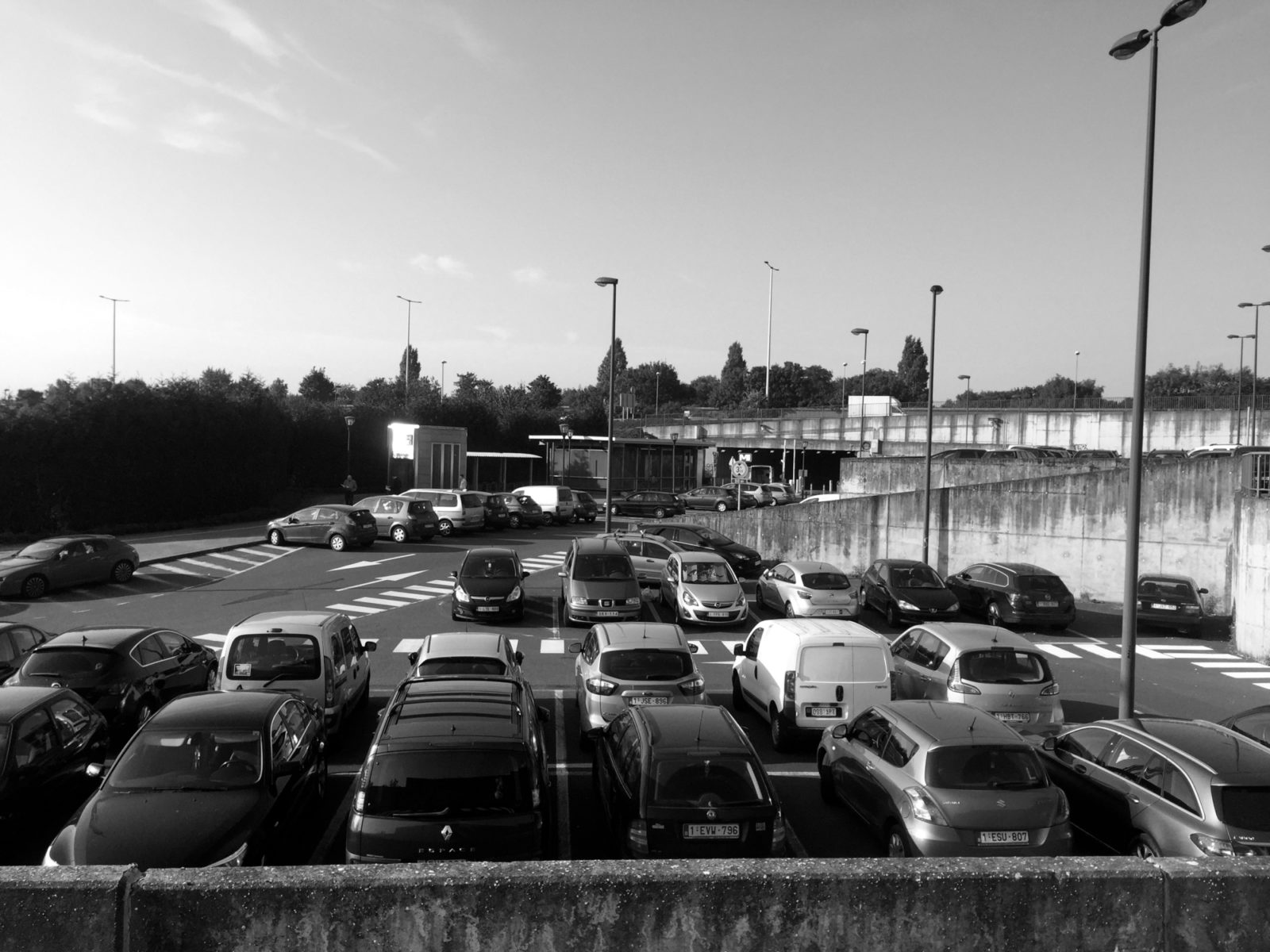
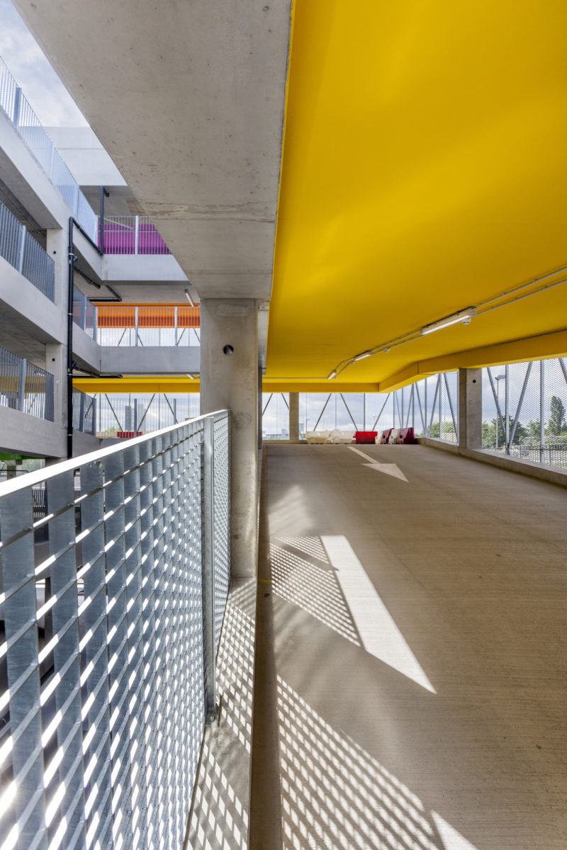
The strength of the project lies in the clear definition of spaces, to provide a building that is adapted to all its users. The separated traffic flows ensure that different types of users do not overlap and optimise circulation inside the car park. There is a clear distinction between the area for private cars on the upper floors and the multimodal area on the ground floor reserved for motorbikes, bicycles and more sustainable and/or alternative use cars (carpooling, shared, electric, etc.). The car park includes a parking area reserved for shared cars and electric cars, including charging stations.

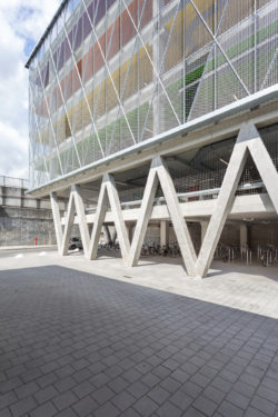
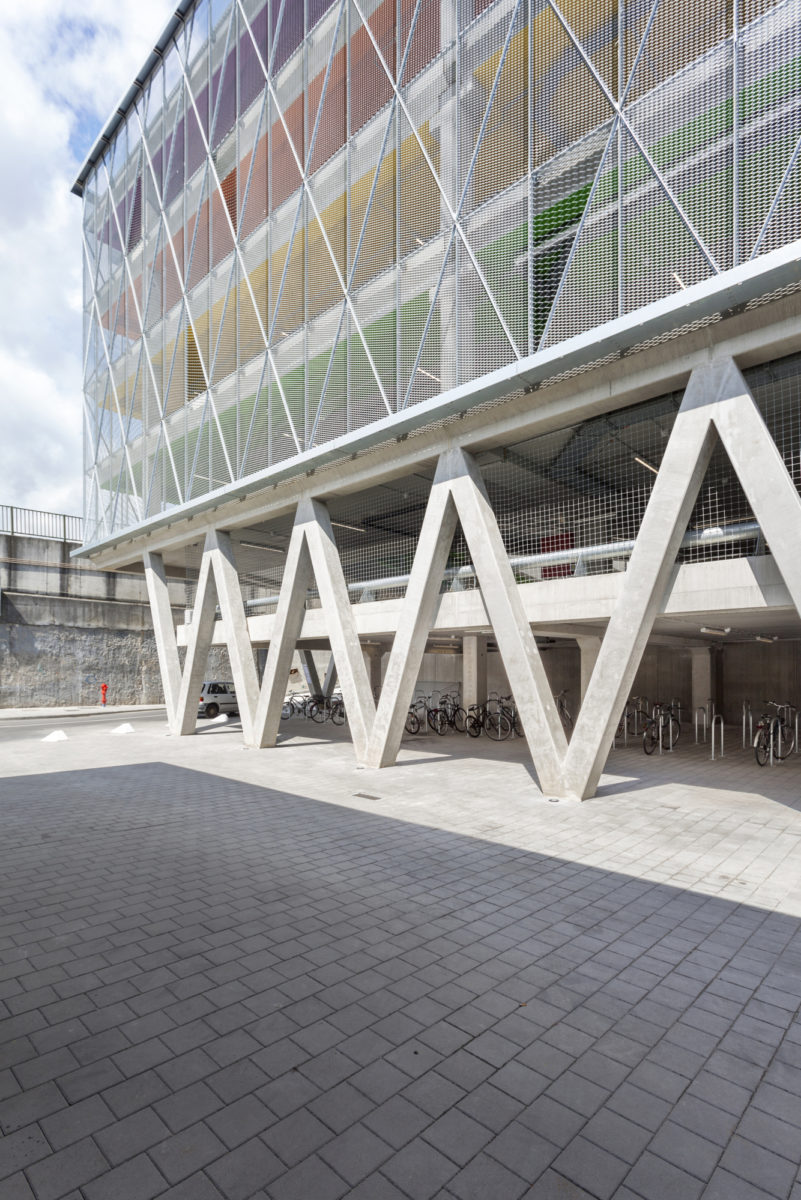
In order to secure and to promote the use of these more sustainable modes of transport, these spaces are located on the upper ground floor, so that they are visible to all and easy to access. There will also be an exclusive parking area for motorbikes, as well as a secure bicycle parking area, directly connected to the existing cycle path.

The differentiation of user flows within the building favours soft modes of transport, optimising the pedestrian space between the car park and the metro entrance by clearing all car and motorcycle traffic from this space.

  • Soft mobility
  • Standard car park

03 Stylistic

Create a landmark in the city: combining aesthetics and technology.

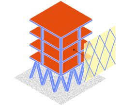
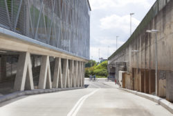
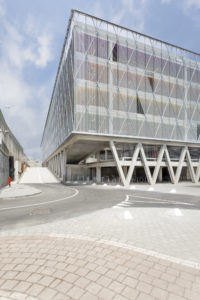
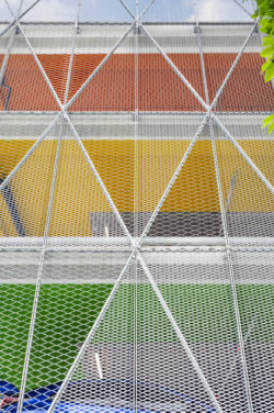
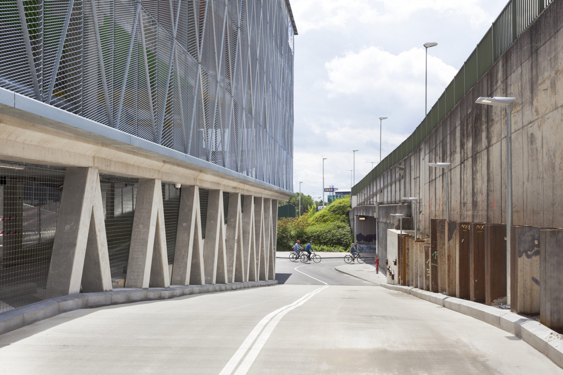
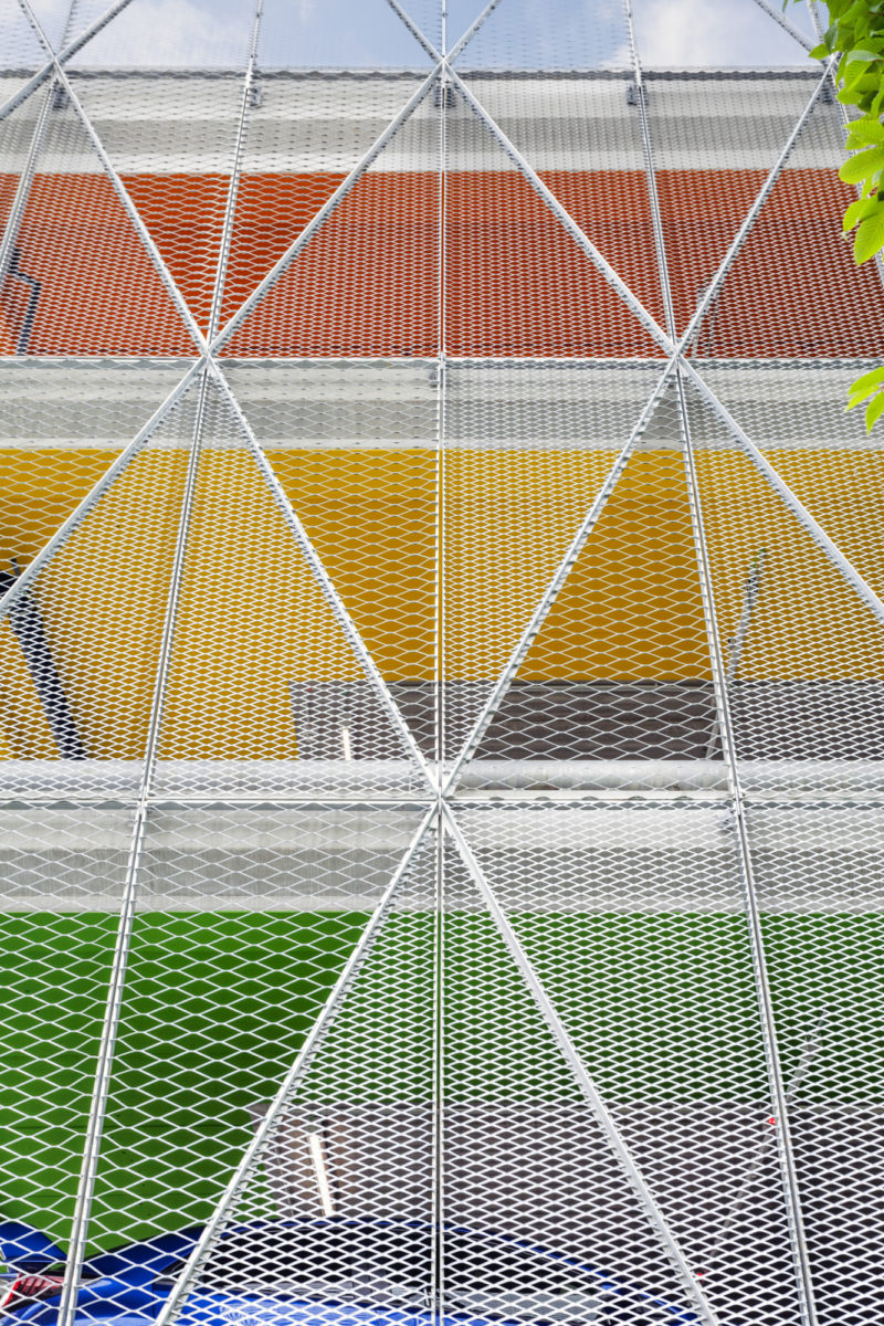
Visible from the Ring, the project is designed as a single visual entity. The expanded metal façade running across the storeys ensures air can pass through the building and thus provides ventilation as well as natural light in the car park; it also acts as a guardrail and an anti-intruder system. Through the use of two metal meshes, this material plays with light and reflections and brings an aesthetic vibration to the entire building.

The building responds to the formal simplicity of its function. Its structural framework, the point of departure for the façade’s design, becomes playful and dynamic. The light, which flows freely through the building, plays with the different colours used in the signage on the floors, stimulating the user experience.

  • Define the form through the structure of the building
  • Guide, inform and stimulate with bright colours
  • Provide light, ventilation and security with the metal mesh

Result

Encouraging the shift towards sustainable mobility: a rewarding project meeting a global challenge.

Technical information

Location
Brussels (Anderlecht), Belgium
Typology
Equipment
Client
Franki (Willemen)
Size
30.000 m²
Status
Completed
Timing
2019
Expertises
Competition, New construction

Team

Do you want to know more about this project?

Discover the project

Contact

Interested in this project? Contact the project partner to get more information

Didier Peremans

Architect - Managing Partner